


Approaching Perfection
Control charts are a basic tool for achieving six-sigma production.
In the November 2013 issue of Canadian Metalworking, the basics of the normal distribution and the origin of “Sigma” and standard deviation were introduced. This month we’ll look at the most basic way that the measurement of actual production attributes contribute to quality production: control charts. Control charts are not a new part of quality control. They were invented by Walter A. Shewhart at Bell Labs in the 1920s, but became famous when his concepts were widely spread by W. Edwards Deming in Japan in the 1950s and ‘60s.
The real reason for control charts is not simply to monitor that a process is producing results close to specification … the true value of control charts is the ability to differentiate between common causes of variation, like machine wear or predictable drift in machine setting over time, and uncommon or special causes of variation. These are the faults that come out of left field like one-time voltage spikes, effects from unseen vibration, or random operator error.
That’s important, because common causes of variation are controllable and more importantly, are predict¬able, allowing corrective action before the process risks the production of nonconforming parts. Uncommon or random causes are usually more difficult to control and can be very difficult to analyze but the control chart highlights them graphically and lets the user know where the production process problem occurred.
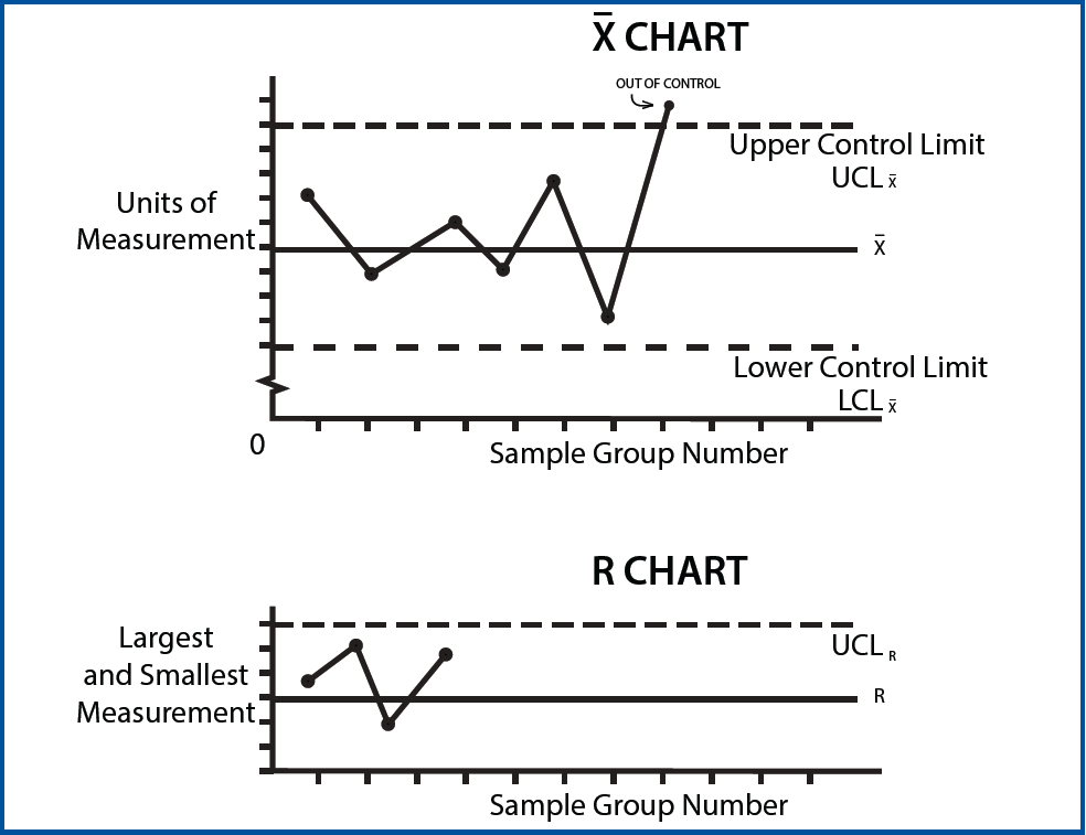
There many ways of establishing a control chart, but a common one is the so-called “X bar R chart”. It’s actually two charts, with the X bar chart measuring the variation in the average value of the samples and the R chart the range of measurements within each subgroup:
THE BASIC X-R CHART
In this chart, the important point to remember is that the horizontal axis isn’t time, it’s a progression of part samples, with each point representing a group of measurements. This means that each data point on the X chart is actually an average value of a small sample of part measurements. How many parts are measured for each data point? There is a mathematical way to determine that too, but in many cases it’s an arbitrary number chosen to give a meaningful average without an inconveniently large sample size.
For a manual process, an operator or inspector might draw a small number of parts, perhaps a dozen out of the process on a regular schedule as the run continues and plots the average of the measurements as a single point on the X chart. What determines when he or she takes the sample? It could be by time, or by part count. This sampling strategy reduces unneeded metrology, without hiding the underlying information about trends that we’re trying to determine. On the other hand, the single outlier might be a defective part, which the average could allow through ….which is where the R comes in. The “R” means range and on this chart the inspector plots the range between the largest and smallest measurement, making it easy to spot one-time or random outliers.
UCL/LCL : THE LIMITS
That establishes what to plot, but what about the actual limits? Graphically, it’s the spread above and below the central line that matters, but what does that line represent? It’s commonly assumed that the central X line in the X chart is the target specification measurement that’s desired, but it doesn’t have to be. It may be the average of the plotted points, an “average of the averages”, or it could be an average of the measurements of the whole sample population, taken from every measurement of every part sampled. The central line is important because it’s the reference point from which the upper and lower control limits are chosen. Control limits can be chosen with strategies as varied as complex mathematics, or a simple judgment call; limits set at plus and minus 3 sigma are commonly used. 3 sigma limits mean that we’ll expect 997 out of every 1000 data points to fall inside the limits. The R chart operates similarly, although with few data points, statistical techniques may not be needed or even useful in setting the control limit. Note that range is an absolute value; there’s no “lower” control limit.
Pencil and paper still works, but affordable software allows many more attributes to be brought under SPC without slowing production efficiency.
TRENDS, NOT ATTRIBUTES
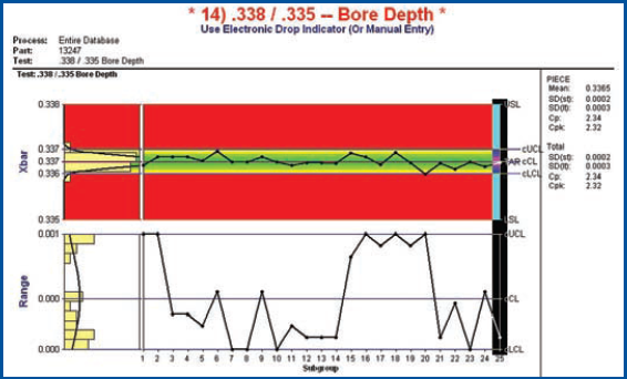
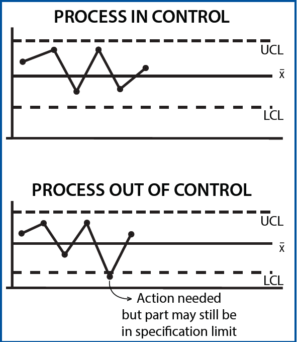
The most important takeaway from any discussion about control charts is that they’re not a direct measure of product quality, or even of specific attributes….they measure trends in the process not the parts. Upper and lower control limits aren’t specification limits: UCL and LCL are normally much narrower that the actual specification, which is the point of the exercise: to show a process that’s trending out of control so you can do something about it before you make bad parts.
It’s also important to note that the upper and lower control limits are based on a central line that’s an average of attribute measurements … The readings that form each data point can be widely scattered; if there are the same number of low and high readings, the average of the measurements will give the same X line as a tightly controlled process. In this case, the R chart will tell the story, although in either case, if the process stays inside the control limits, the process is running well.
It’s important to note that a well-designed charting system should show data points above and below the central line … this is the area of natural variation, com¬pared to outside the limit readings, which are the red flag that action is needed. If the chart is a flat line at or near the central line, the resolution of the measuring technique is too coarse, or the attribute doesn’t need extensive sampling for controlled quality. Tool wear is easily tracked with an X and R process. As wear increases, for example, an external dimension will cause a climbing chart while and internal process like a bored hole will show a diameter decrease.
Monitored correctly, the charting can not only show when scheduled tool changes should be programmed but also the economic tool life. When changing tool types or brands, the cost effectiveness of the new product can be measured by comparing the charts, for example.
X and R charts show how the attribute is trending, allowing corrective action long before a defective part shuts down a process.
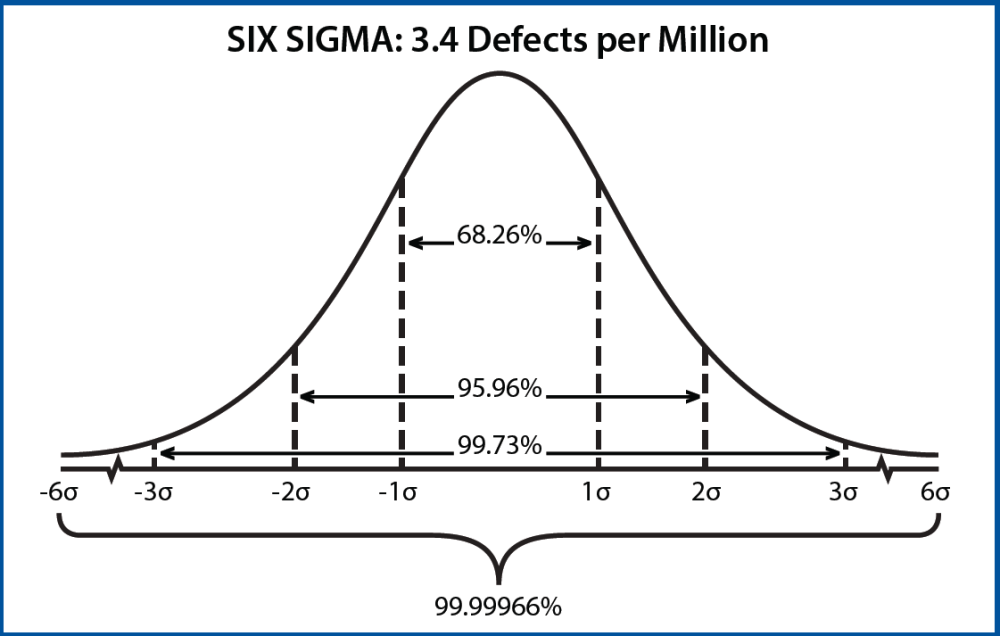
What about that standard deviation bell curve? A straight sigma-type analysis is an after the fact measurement of the characteristics of a large number of parts …it’s based on averages, so one-time events and outliers can disappear. That doesn’t mean it’s not valuable. Overall, the sigma level sets the number of defects allowable for a given production run. As the drawing shows, a one sigma or one standard deviation subset of a sample population covers 68.26% of the sample, while the three-sigma level embraces 99.73%.
A six-sigma distribution represents 99.99966% of the data under the curve. In manufacturing terms, a six-sigma process produces 3.4 reject parts per million parts produced, or more accurately, 3.4 out of spec attributes per million attributes measured. For small to medium run manufacturing, it’s essentially zero defects.
It’s a great way to show diagrammatically that you’re a competent part maker, but how about real time monitoring? For decades, tracking the process as it runs rather than historically with standard deviation calculations, has been about control charts. Modern systems can generate these charts automatically, but even if it’s performed machine side with a pencil and paper, X and R charts show how the attribute is trending, allowing corrective action long before a defective part shuts down a process. It’s not fortune-telling, but it’s a time-tested, simple way to avoid shop floor crises.
Out of control ... what then?
The principle of using control charts to track a process is to keep an attribute within a range of values that triggers corrective action long before the part goes out of specification. Upper and lower control limits are moving targets. As the process gets more precise and more accurate, the limits close up, and if the graphical scale is adjusted accordingly, there should be a visible randomness or scatter to the X-bar trace. That’s a good thing; there is always observable randomness in measurement at a sufficiently small scale, so if the charting process is a flat line, it’s useless as a quality tool. The key to dealing with an out of control attribute is to use a plan of action, not a guess about the cause. Take a bored hole that’s out of control in concentricity, for example. Is it the insert, toolholder or workholding device? Consider the insert alone. Is the correct type and grade for the job? Was it installed correctly? Is it running near the edge of its performance envelope for the application? Was the insert changed recently, either the grade or brand? Is it damaged? Can the toolholder lock it down firmly? Is it worn? That’s seven possibilities for the insert alone, with at least that many as the investigation moves closer to the spindle. To avoid unnecessary guesswork, it’s important to ask three initial questions: Has this type of failure occurred before? Were the conditions similar to this failure? This is important to determine if the out of control data point is a random or controllable event. Has the process been changed since the last run of this process? If so, then past experience may lead the investigator astray. Is the process capable? If there’s no capability study, it’s a judgment call about the ability of the process to stay in control. No amount of adjustment of the toolholder, for example, will compensate for a worn out spindle or a machine driven past it’s recommended ratings. A quick solution is often to fit a backup tool/toolholder (especially if this is a familiar issue) to get in-control production up and running, allowing the inspector or manager to track down the problem without interrupting production. If this works, a thorough understand of the root cause may not be necessary in the short run … but if the process is worth controlling by statistical means, it’s probably not a short run.
About the Author
About the Publication

subscribe now


Keep up to date with the latest news, events, and technology for all things metal from our pair of monthly magazines written specifically for Canadian manufacturers!
Start Your Free Subscription- Stay connected from anywhere

Easily access valuable industry resources now with full access to the digital edition of Canadian Metalworking.

Easily access valuable industry resources now with full access to the digital edition of Canadian Fabricating & Welding.
- Trending Articles
1
Sustainability Analyzer Tool helps users measure and reduce carbon footprint

2
GF Machining Solutions names managing director and head of market region North and Central Americas

3
Mitutoyo updates its end-user portal

4
Enhance surface finish with high-speed machining

5
Portable 3D scanners offer adjustable scanning distance, advanced volumetric accuracy